
How to Paint a Colour Wheel - Step by Step
- Sierra Peca

- Feb 11, 2022
- 7 min read
Updated: Dec 19, 2022
Using Primary Colours
You’ve probably seen a colour wheel before, but maybe you didn’t know what each colour meant. There are so many colours on a colour wheel, that at first it can seem confusing, but colour wheels are very useful tools we use when creating art. Whether it’s digital art, acrylic paintings, or even watercolour, colour is essential, which is why it’s one of the elements of art. Colours can be combined to make new ones, which is really important to know and practice when creating art. To use the colour wheel, it’s important you understand all the different parts and purposes of it. But before we get into that, let's talk about some other terms related to colour that you may or may not know!
Not a big reader? No worries! We have a short YouTube tutorial that shows the step-by-step process on How to Paint a Colour Wheel.
What is the purpose of a colour wheel?

A colour wheel allows for people to see the main colours, like primaries, secondaries, and tertiaries, in one place. It reveals what mixtures of colours can be made and what relationship colours have to one another. Colour wheels are also great tools we can use to practice our own mixing of hues so that we know how much paint we need to make certain colours. Then when we make art, or choose colour schemes, we have a wheel to reference back to.
What are the true primary colours? RYB vs CMY

Traditional primary colours (RYB)
The primary colours we usually see in traditional colour wheels are red, yellow, and blue (known as RYB). These are colours that can’t be made from other pigments, but are used in combination to make all other colours (secondary and tertiary). Although red, yellow and blue are the most traditional and commonly known primary colours (the ones you learn in school), red and blue are not technically true primaries.
Printer primary colours (CMY)
Did you know that red can be mixed using magenta and yellow, and blue can be made with cyan and magenta? Therefore, cyan, magenta, and yellow are the actual true primary colours (also known as CMY). These hues mix more vibrant secondary and tertiary colours and can combine to make nearly every colour of pigment without becoming muddy – like we often see in RYB colour wheels.
For example, it’s very difficult to mix vibrant purples using red and blue, but it’s possible with magenta and cyan. CMY are the primary colours that printers use because they create the widest gamut in pigment, or colour range. Try it for yourself the next time you are experimenting with mixing colours!
What are secondary colours?

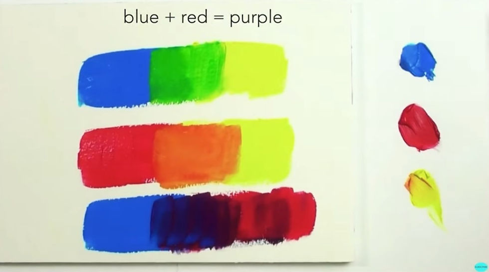
Secondary colours are formed when two primary colours are mixed together. The three secondary colours on a traditional colour wheel are orange, green and violet. So, if we are using a RYB colour wheel and mix together red and yellow, the secondary colour would be orange. When we mix red and blue, we will get violet, and yellow and blue will make green.
What are tertiary colours?

Tertiary colours are formed when a secondary colour is mixed with a primary colour. There are six tertiary colours in total: two between each primary colour! An example of a tertiary colour is when yellow and orange are mixed together to make yellow-orange, or when red and violet are mixed together to make red-violet. This continues all the way around the colour wheel.
Tip: Tertiary colours are nearly impossible to mix accurately on a colour wheel without mixing the primary and secondary colours first.
How to Paint a 12 Step Colour Wheel
A Guide for Teachers (Grades 6+)
This exercise is recommended for students in grades 6+ [according to the Ontario Art Curriculum]. Younger students may do a simpler version of this exercise with a 6-step colour wheel focusing on the primary and secondary colours.

Before we get into how to paint the colour wheel, we first need to prepare our workspace. Here are three quick steps to get ready:
1. Draw the colour wheel

Trace a plastic cup or roll of tape to make your outer and inner circle.
2. Divide the colour wheel

Use a ruler to divide the circle in half, then half again, and then divide each quarter into thirds so that each half has six sections. This should make a total of 12 sections.
3. Prepare your primary colours

Your colour wheel palette (if you choose to use paint, you can use oil, acrylic, watercolour, or even gouache. If you don’t have access to paint, pencil crayons will also work!) will only include three colours – cyan, magenta, and yellow. If you don’t have access to these colours, then red, blue and yellow will work too! You won’t need too much paint, so a small blob of each is enough, although you will likely use much more yellow than the other pigments since it is the lightest colour. Also be prepared with a cup or bowl of water and a napkin to clean your brush in between colours!
Start with primary colours

1. Begin painting your primary colours by applying the colour yellow in one of the sections you made. Yellow is an easily contaminated colour, so painting it first will make sure it is pure.
2. Paint the colour red (or magenta) with three spaces in between it and the yellow section.
3. Paint the colour blue (or cyan) three spaces away from the yellow and red sections. Your three colours should be evenly spread out across your wheel.
Note: Not all pigments are the same – some reds lean towards yellow, and some magentas appear purple. Pigments that are labelled “primary red”, “primary yellow” or “primary blue” will be the most balanced primary colours.
Mix the secondary colours

4. Begin painting your secondary colours by mixing yellow and red to make orange. You’ll probably notice that the mixture is not going to be 50/50, since red is more overpowering than yellow. Start with yellow, and gradually add a little bit of red until the orange feels like it fits exactly in between these colours. Apply it to the box in the centre of yellow and red (it should have two empty spaces on each side.
5. Repeat step four with red and blue to make a violet colour that will sit between the two.
6. Once again, repeat step four with yellow and blue to make a green that isn’t too dark or too light.
Tip: Some colours are more powerful than others, so always start with your lightest colour and slowly add your darker colour.
Mix the tertiary colours

Next, paint your tertiary colours. This step has to be done after the secondary colours are painted, because otherwise you won’t know how much of each paint to mix together, and it will be difficult to visualize the exact colour in between. This step can be done once the secondary colour next to it is painted (you don’t have to wait until all secondaries are painted).
7. Mix together yellow and orange to make a yellow-orange. This will be placed in the empty space between yellow and orange.
8. Mix together orange and red to make orange-red and paint in the empty space between them.
9. Mix together red and violet to make red-violet that will be placed between them.
10. Mix together blue and violet and place the blue-violet in the empty space.
11. Mix together blue and green to make blue-green to and apply it to the gap.
12. Finally, mix together yellow and green to make yellow-green. This will fill in the final empty space, completing your colour wheel!
Are black and white colours?

Black and white are pigments, but not technically colours. Instead of a colour, white is used to create tints. When added to a colour, white creates lighter tints of that colour, like pastels. In a similar way when black is added to a colour, it creates darker shades. When black or white is added to a colour, it lowers that colour’s saturation. Some colour wheels include tints and shades, but we won’t be using them in this colour wheel.
What paints should I use?

When you’re building your colour wheel, it may be difficult to choose a type of paint to work with. The first thing you want to look for is a paint that is vibrant. Watercolour can be challenging to build an opaque base, so in that sense, acrylic is a lot more vibrant. You also want to consider that the colours in the wheel are placed right next to each other. Watercolours tend to bleed or seep into colours placed next to them while they’re still wet. This means you would have to wait for the surface to dry completely before adding colours next to it. Acrylic paint dries quickly and even while it’s wet, it doesn’t seep into nearby colours. For vibrancy and efficiency, acrylic or gouache paint is the way to go!
How famous artists used the colour wheel

Famous artists use the colour wheel to choose colour palettes for their artwork. It helps them understand which colours work best together and create contrast. One way this is done is with complementary colours. This is when colours that are opposite each other on the colour wheel are used to make each other stand out. Van Gogh is an artist that is known for using different colour schemes in his work while also keeping his colours bright and saturated. Café Terrace at Night is a painting that uses complementary colours. He uses blue and orange to create contrast and make each colour pop.
Another artist that uses the colour wheel when making their art is Emily Carr! A lot of her work uses analogous colour schemes. An analogous colour scheme uses three colours that are next to each other on the colour wheel. We can see this in her painting Into the Forest, where blues and greens are mixed to form a landscape.
There are many different types of colour schemes that are made by referencing a colour wheel. To learn more about the different types of colour relationships that the colour wheel creates, visit our All About Colour Palettes blog that breaks down complementary, monochromatic, analogous, and triadic colour schemes.
To learn more about colour mixing, visit our Elements of Art - Colour blog post.
Teacher Resources

If you’re a teacher that would like worksheets about colour theory, check out our classroom resources:
If you’d like more worksheets related to art, check out our teachers pay teachers page where you can get worksheets and lesson plans for your classroom! More classroom resources like this can be found on our art resources for teachers page, where we cover colour theory and more!

Any teacher now can facilitate world-class visual art lessons — even with no art experience! Get our art courses designed for classrooms, complete with step by step video lessons, assessment tools and handouts you can use every year.
If you're an educator, you're eligible for special pricing — 50% off our regular course price! Art Projects for Your Classroom

Click that heart if you like this post! If you found this helpful, please help us share the knowledge with others.


.png)
.png)
.png)
.png)
.png)
.png)

